Google Apps Enhance Usability with New Colorful Icon Shortcuts
Google Apps Unveil Colorful Icon Shortcuts
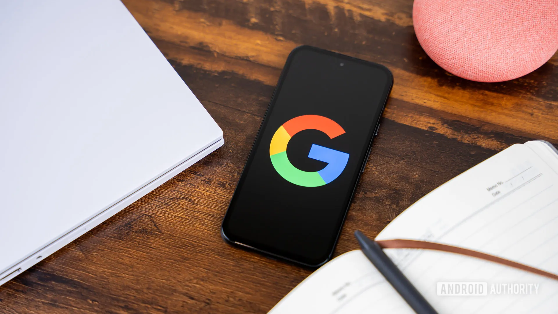
Google apps are set to transform the way users interact with their devices through new colorful icon shortcuts. This exciting update improves usability on the Android platform while aligning visual design with the iOS version. Users will appreciate the added accessibility, making navigation within Google apps more intuitive. As a result, these changes are poised to significantly enhance user engagement and satisfaction.
Key Features of the Update
- Colorful Icons: Bringing vibrancy to the interface.
- Improved Usability: Enhancements that cater to user needs.
- Consistency across platforms: Harmonization between Android and iOS users.
Impacts on User Engagement
This update is an essential step in Google's commitment to delivering innovative features to its users. By embracing aesthetic improvements alongside functionality, Google apps are setting new standards in the app ecosystem.
This article was prepared using information from open sources in accordance with the principles of Ethical Policy. The editorial team is not responsible for absolute accuracy, as it relies on data from the sources referenced.