Mobile Apps: The Duolingo Icon Redesign Controversy Explained
Thursday, 29 August 2024, 09:19
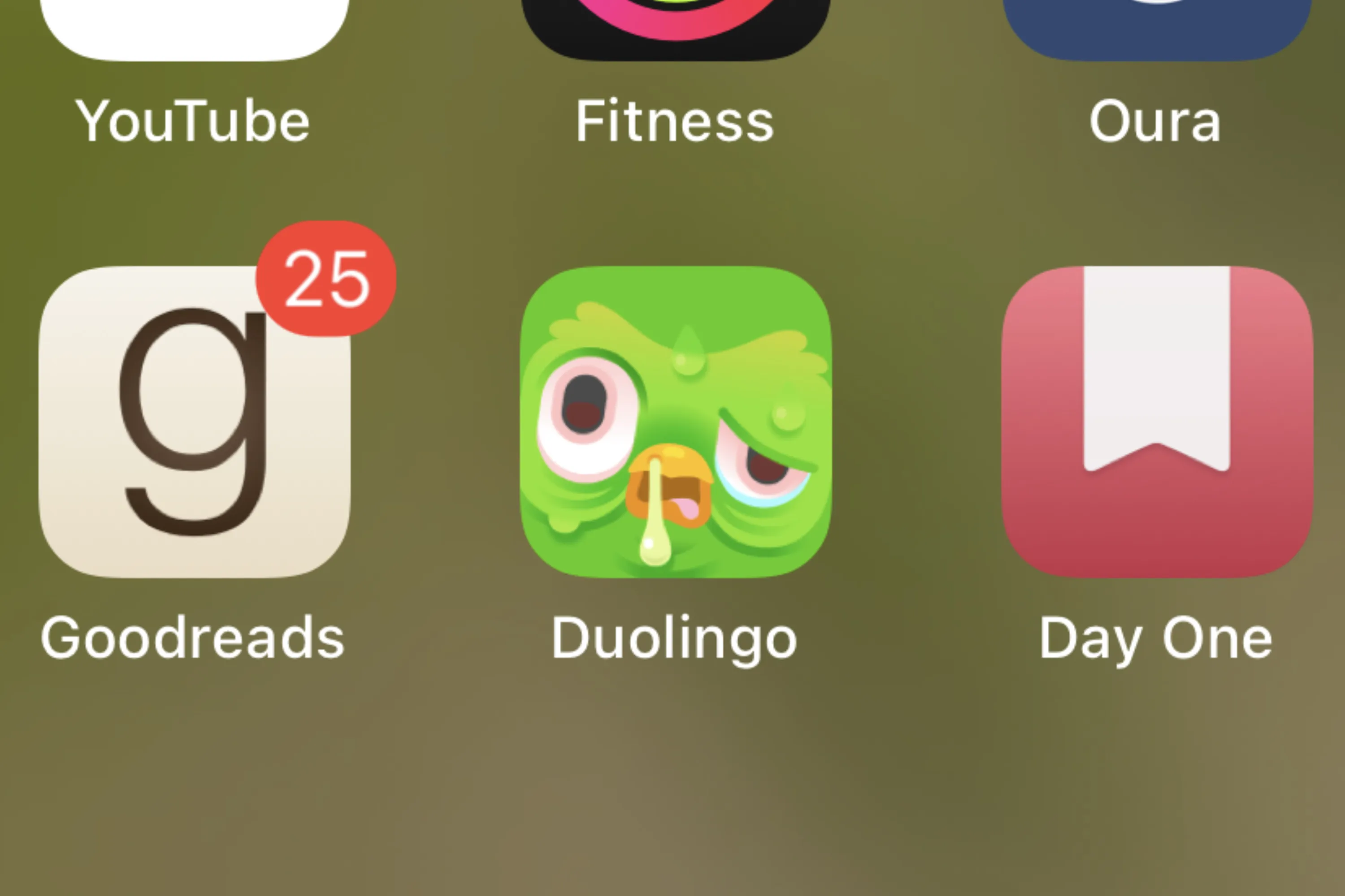
The Mobile Controversy Over Duolingo's Icon
The mobile app community is buzzing about the new changes to the Duolingo app icon. Users across Android and iOS platforms express dissatisfaction.
What Users Are Saying
- Many users on mobile platforms feel the updated icon lacks the charm of its predecessor.
- Feedback indicates that the redesign could impact user engagement with the apps.
Implications for App Design
This incident highlights the critical role of UI in mobile apps. The controversy serves as a reminder that even minor design changes can significantly affect user perception.
This article was prepared using information from open sources in accordance with the principles of Ethical Policy. The editorial team is not responsible for absolute accuracy, as it relies on data from the sources referenced.