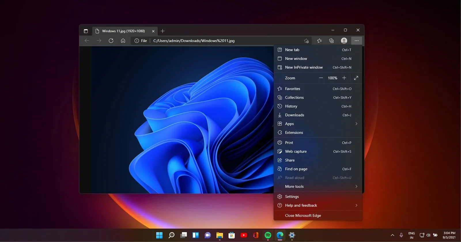
Microsoft Edge Turns Heads with Tab Design Overhaul

Microsoft Edge's Bold New Tab Design
Microsoft Edge is set to ditch its rounded corners for tabs, opting for a sleeker, more angular design. This change appears to align with current software design trends emphasizing clean lines and simplicity.
What's Behind the Change?
As Microsoft doesn't provide a clear rationale for this alteration, users are left wondering what prompted this shift. However, the update is part of Edge's ongoing efforts to improve usability and aesthetics.
- Enhanced User Experience: The new design promises a more streamlined interface.
- Alignment with Trends: Modern software aesthetics are increasingly favoring angular designs.
- User Speculation: Many are curious about the motivations behind this change.
In conclusion, as Microsoft Edge continues to evolve, users can expect ongoing adjustments aimed at optimizing their browsing experience. Stay tuned for further updates as this story develops.
This article was prepared using information from open sources in accordance with the principles of Ethical Policy. The editorial team is not responsible for absolute accuracy, as it relies on data from the sources referenced.