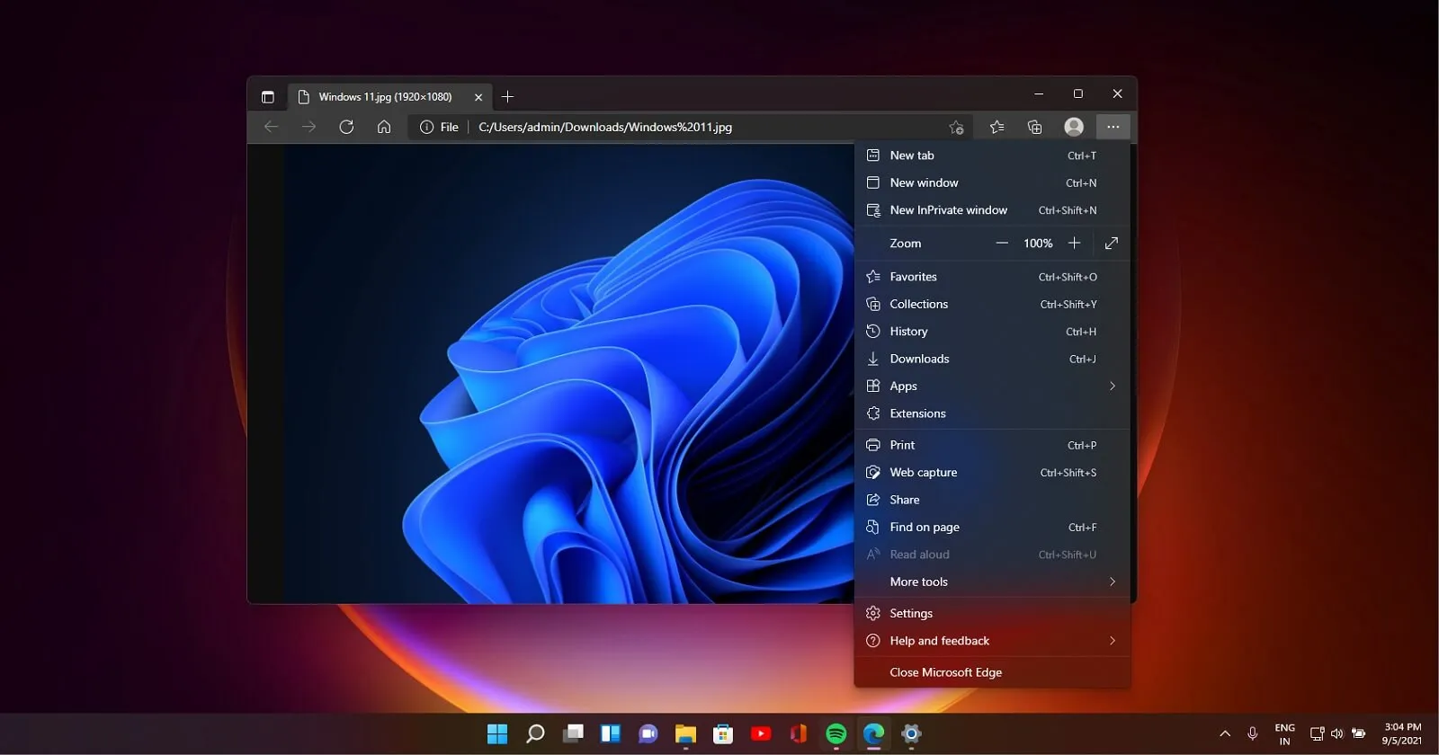
Microsoft Edge Tabs Redesign: A Move Away from Rounded Corners

Microsoft Edge's New Tab Design
Microsoft Edge has recently announced a significant change to its user interface. The popular web browser is set to remove rounded corners from tabs, a design choice that many users have come to appreciate. The decision has sparked a variety of reactions from the user community, with some expressing concerns over the lack of clarity regarding this modification.
Why the Change?
While Microsoft has not provided a concrete explanation for this move, it aligns with ongoing trends in browser development aimed at enhancing functionality and modernizing the user experience. This tweak could influence how users interact with the browser and even affect broader design philosophies across tech interfaces.
Future Implications
As Microsoft continues to refine Edge, the removal of these rounded corners could signify a more significant shift in how web browsers approach design. Keeping an eye on these developments is crucial for users who prioritize both aesthetics and usability.
This article was prepared using information from open sources in accordance with the principles of Ethical Policy. The editorial team is not responsible for absolute accuracy, as it relies on data from the sources referenced.