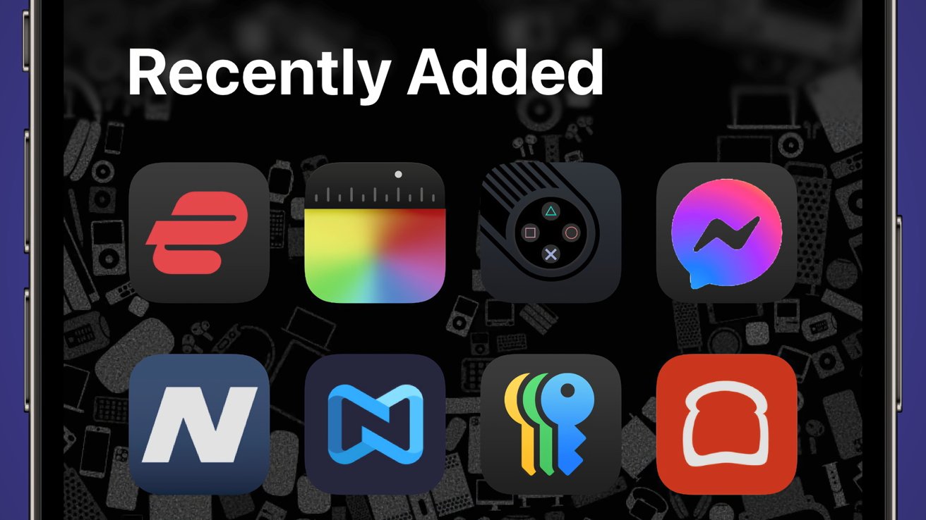
Exploring the Impact of Dark Mode Icons on Apps in iOS 18 Beta 3
Monday, 8 July 2024, 20:21

Exploring the Impact of Dark Mode Icons on Apps in iOS 18 Beta 3
Apple's latest update, iOS 18 beta 3, introduces a change that enforces dark mode icons on all applications with simple color palettes.
Key Points:
- Dark Mode Icons: Every app now showcases dark mode icons, affecting visual presentation.
- Design Impact: The change influences design consistency across the iOS ecosystem.
- User Experience: Users and developers are experiencing both positive and negative effects.
The decision's implications highlight the evolving design choices within iOS and the ongoing quest for a seamless user experience.
This article was prepared using information from open sources in accordance with the principles of Ethical Policy. The editorial team is not responsible for absolute accuracy, as it relies on data from the sources referenced.