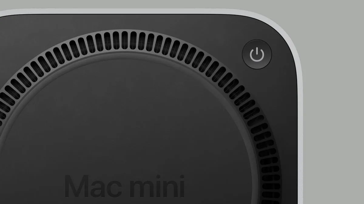
Apple's M4 Mac Mini Power Button Design Choice Explained

Apple's Bold Design Choice for the M4 Mac Mini Power Button
The recent release of the M4 Mac mini has generated excitement due to its powerful chipset and compact design. However, its controversial power button placement has led to discussions among tech enthusiasts. Apple decided to relocate the power button to the bottom of the device, diverging from its previous placement at the back alongside other ports.
What Apple Executives Had to Say
During an interview with industry analysts, Apple’s Greg Joswiak and John Ternus addressed this significant design adjustment. They emphasized that the intention behind the M4 Mac mini's power button placement was to enhance the overall aesthetics and functionality of the computer.
Understanding the Trade-offs
- The new placement may affect user convenience.
- Design aimed at a sleeker appearance.
- More variations in user feedback due to the change.
While the M4 series represents innovation and progress in Apple's computer line, this design decision will continue to be a topic of discussion among new and prospective users alike. Exploring the balance between aesthetics and usability is crucial for understanding modern tech designs.
This article was prepared using information from open sources in accordance with the principles of Ethical Policy. The editorial team is not responsible for absolute accuracy, as it relies on data from the sources referenced.