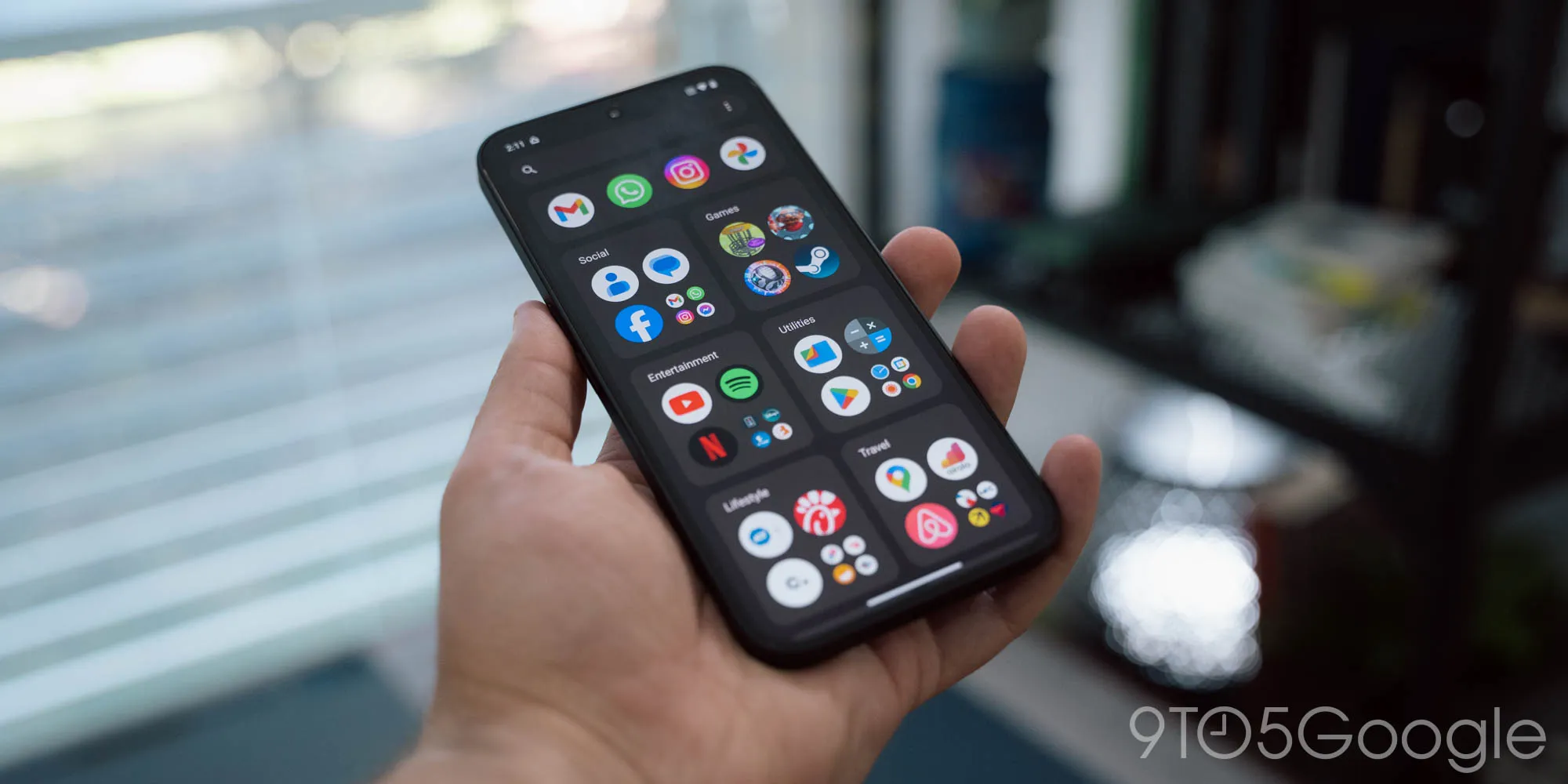
Nothing OS 3.0 and its iOS App Library Inspiration: An In-Depth Look

Nothing OS 3.0 Enhancements
This latest version introduces several crucial features aimed at improving usability and performance. The updates are focused on delivering a seamless user experience while integrating fresh functionalities that set it apart.
The Controversy of the Smart Drawer
A focal point of discussion surrounds the inclusion of the Smart Drawer, a feature reminiscent of the iOS App Library. This decision has led many to wonder whether Nothing is charting new territory or simply borrowing from Apple’s design.
- Improved User Interface: The new UI promises smoother navigation.
- Enhanced Performance: Optimizations aim to reduce lag and improve responsiveness.
- Smart Drawer Feature: Critics question the originality of this design.
As tech enthusiasts delve into Nothing OS 3.0, the questions linger. Will this update redefine the user experience or lead to accusations of imitation?
This article was prepared using information from open sources in accordance with the principles of Ethical Policy. The editorial team is not responsible for absolute accuracy, as it relies on data from the sources referenced.