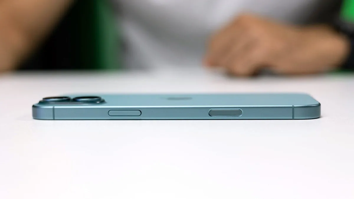
Apple Revolutionizes User Experience with iPhone 17's Three-Button Design

The Future of Smartphones: iPhone 17
Apple's latest breakthrough with the iPhone 17 is poised to transform user interaction. By streamlining the button layout to just three buttons, Apple targets a more intuitive experience for users. The iPhone 17's design not only simplifies usage but also combines elegance and efficiency. Imagine a device where every action is within easy reach, allowing users to navigate their smartphones effortlessly.
Enhanced Usability with Fewer Buttons
- The iPhone 17's three-button system aims at reducing clutter.
- Users no longer need to stretch for the Action Button.
- Emphasis on a sleek, minimalist design without sacrificing core functionalities.
Implications for Future Devices
This design could set a precedent for future smartphone models, pushing other companies to follow suit in pursuing simplicity and elegance. As technology evolves, Apple continues to prove its commitment to innovation and user satisfaction.
This article was prepared using information from open sources in accordance with the principles of Ethical Policy. The editorial team is not responsible for absolute accuracy, as it relies on data from the sources referenced.