Google Phone App Gets an iOS-Inspired Makeover

The Google Phone App's New Look
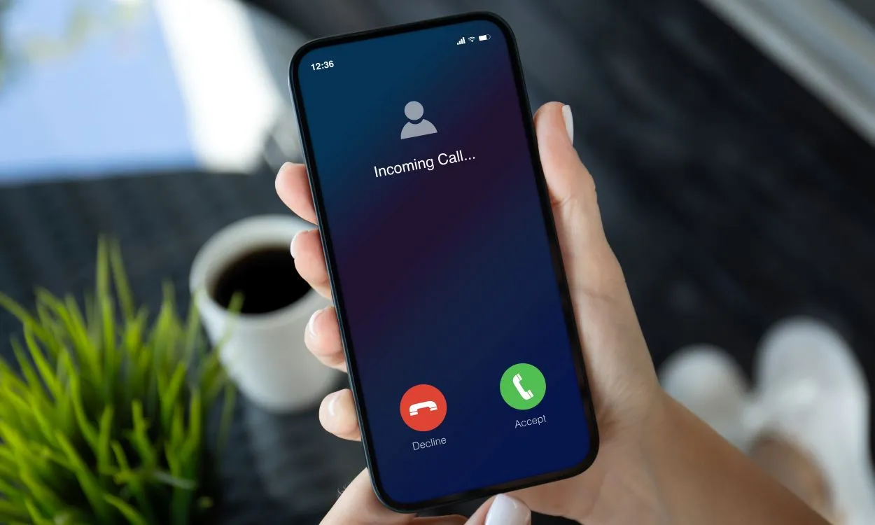
The Google Phone app is set to launch a fresh redesign that mirrors the aesthetic of the popular iOS Phone app. This noteworthy update aims to enhance user experience by focusing on streamlined navigation and intuitive features.
Key Features of the Redesign
- Modernized Interface: The new design presents a clean interface that emphasizes usability.
- Color Palette Adjustments: Subtle hues make the app more visually appealing.
- Enhanced Functionality: The redesign introduces improved call screening tools and contact management.
Implications for Users
This transformation signals a trend towards prioritizing user experience among tech giants. As Google continues to evolve its applications, users can expect more intuitive designs in the future.
This article was prepared using information from open sources in accordance with the principles of Ethical Policy. The editorial team is not responsible for absolute accuracy, as it relies on data from the sources referenced.