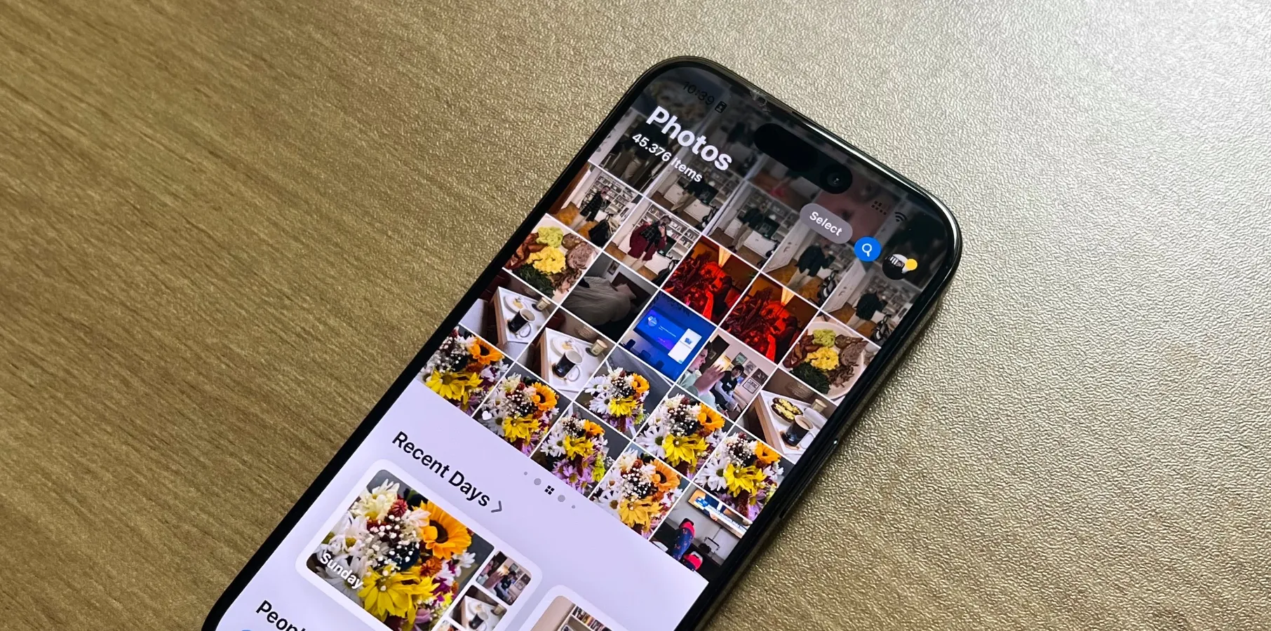
Apple iOS 18 Photos App Redesign: A User's Guide to Fixing Common Issues

Understanding the iOS 18 Photos App Redesign
With the launch of Apple's iOS 18, users have taken to social media to voice their opinions about the revamped Photos app. Many find the new interface less intuitive, citing a loss of familiar features. However, some users appreciate the overhaul for its modern design and improved functionality.
Common Issues and Fixes
Here are a few tips to address the most significant hiccups users are encountering:
- Missing Carousel View: If you miss the Carousel view, try using the grid layout for a quick overview of your photos.
- Organizing Memories: Create albums to better organize your images and ensure your gallery is aesthetically pleasing.
- Hiding Unwanted Screenshots: Use the new hiding feature to keep your library clean and free of clutter.
Despite the mixed reactions, the Photos app continues to be a vital part of the iPhone experience. Beta feedback may lead to future improvements that cater to user preferences.
This article was prepared using information from open sources in accordance with the principles of Ethical Policy. The editorial team is not responsible for absolute accuracy, as it relies on data from the sources referenced.