The Challenge of Crafting Beautiful Menus in Persona and Metaphor: ReFantazio

The Challenge of Crafting Beautiful Menus in Persona and Metaphor: ReFantazio
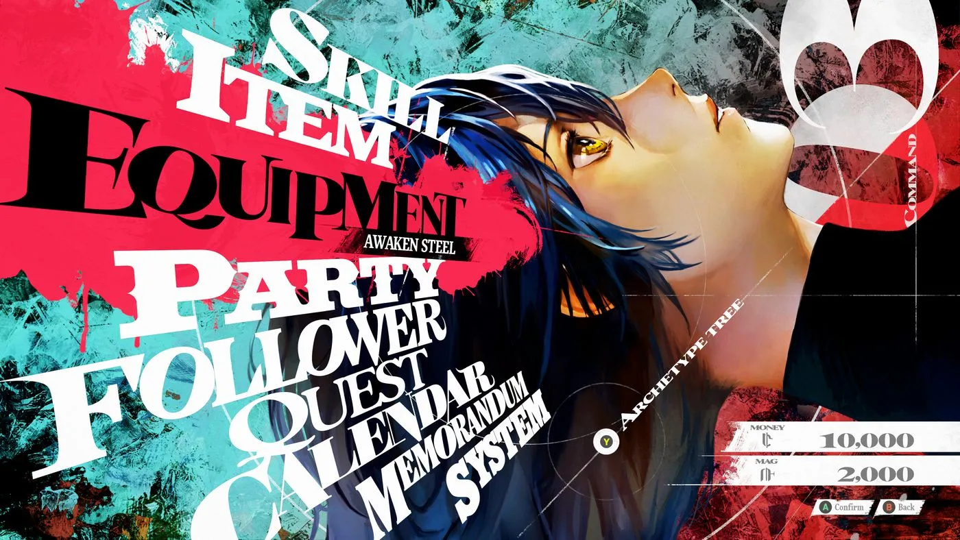
Persona's beautiful menus set a high bar in gaming, though the process behind them is a laborious one. Persona director Katsura Hashino reveals the complexities involved in achieving both functionality and aesthetic appeal in games like Metaphor: ReFantazio. From unique designs to separate programs running for each menu, this interview sheds light on the dedication required.
Beautiful Menus: A Labor of Love
In an interview with Hashino, it was clear that creating stylish menus is indeed really annoying work. He explains, "In general, the way most game developers make UI is very simple. That’s what we try to do as well—but maybe the reason that we’ve achieved both [functionality and beauty] is that we have unique designs for each menu." This approach requires a lot of time, as they run separate programs for each menu, impacting both the shop and main screens.
Evolution Over Time
- Games like Persona 3 had stylish menus, but later titles have shown an evolution.
- With Metaphor, the designs are more elaborate and animated.
- Hashino mentions that the evolution comes from years of accumulated knowledge.
As for the angular designs in Persona 5 that caused readability issues, Hashino notes, "It was impossible to read at first, so we did lots of tweaking and adjusting." This balance between aesthetics and usability is what makes both Persona and Metaphor exceptional.
Experience the beautifully crafted menus and the rest of Metaphor: ReFantazio when it launches on October 11th.
This article was prepared using information from open sources in accordance with the principles of Ethical Policy. The editorial team is not responsible for absolute accuracy, as it relies on data from the sources referenced.