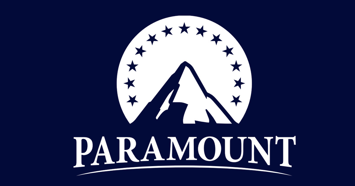
Assessing the Skydance-Inspired Revamp of Paramount's Logo: A Brand Identity Analysis
Monday, 15 July 2024, 00:55

Assessing Paramount's Logo Redesign
The introduction of a Skydance-inspired logo in an investor presentation has sparked discussions about the brand's visual identity.
Pros and Cons
- Pros: Potential refresh to modernize image.
- Cons: Departure from the iconic emblem may alienate loyalists.
In conclusion, the fate of the new PARAMOUNT logo is uncertain, with divergent opinions on its merits and potential reception among consumers.
This article was prepared using information from open sources in accordance with the principles of Ethical Policy. The editorial team is not responsible for absolute accuracy, as it relies on data from the sources referenced.